

AI Integration Quick Reference
AI Integration Quick Reference
Prerequisites
You need three things from the CometChat Dashboard:
You also need Node.js 18+ and npm/yarn installed.
Step 1 — Create a React Project
- Vite (recommended)
- Create React App
Step 2 — Install the UI Kit
- npm
- yarn
Step 3 — Initialize, Login, and Render
CallCometChatUIKit.init() and CometChatUIKit.login() before rendering your app. Then wrap your components in CometChatProvider.
For development, use one of the pre-created test UIDs:
cometchat-uid-1 · cometchat-uid-2 · cometchat-uid-3 · cometchat-uid-4 · cometchat-uid-5
src/main.tsx
src/App.tsx
CometChatProvider supplies theme, locale, plugin registry, and event context to all child components. Init and login must complete before the provider mounts. See the CometChatProvider guide for all props.
For production, use
CometChatUIKit.loginWithAuthToken(token) instead of login(uid). Generate auth tokens server-side via the REST API. Never ship auth keys in client code.By default, session data is stored in
localStorage. To use sessionStorage instead, see Setting Session Storage Mode.Step 4 — Run
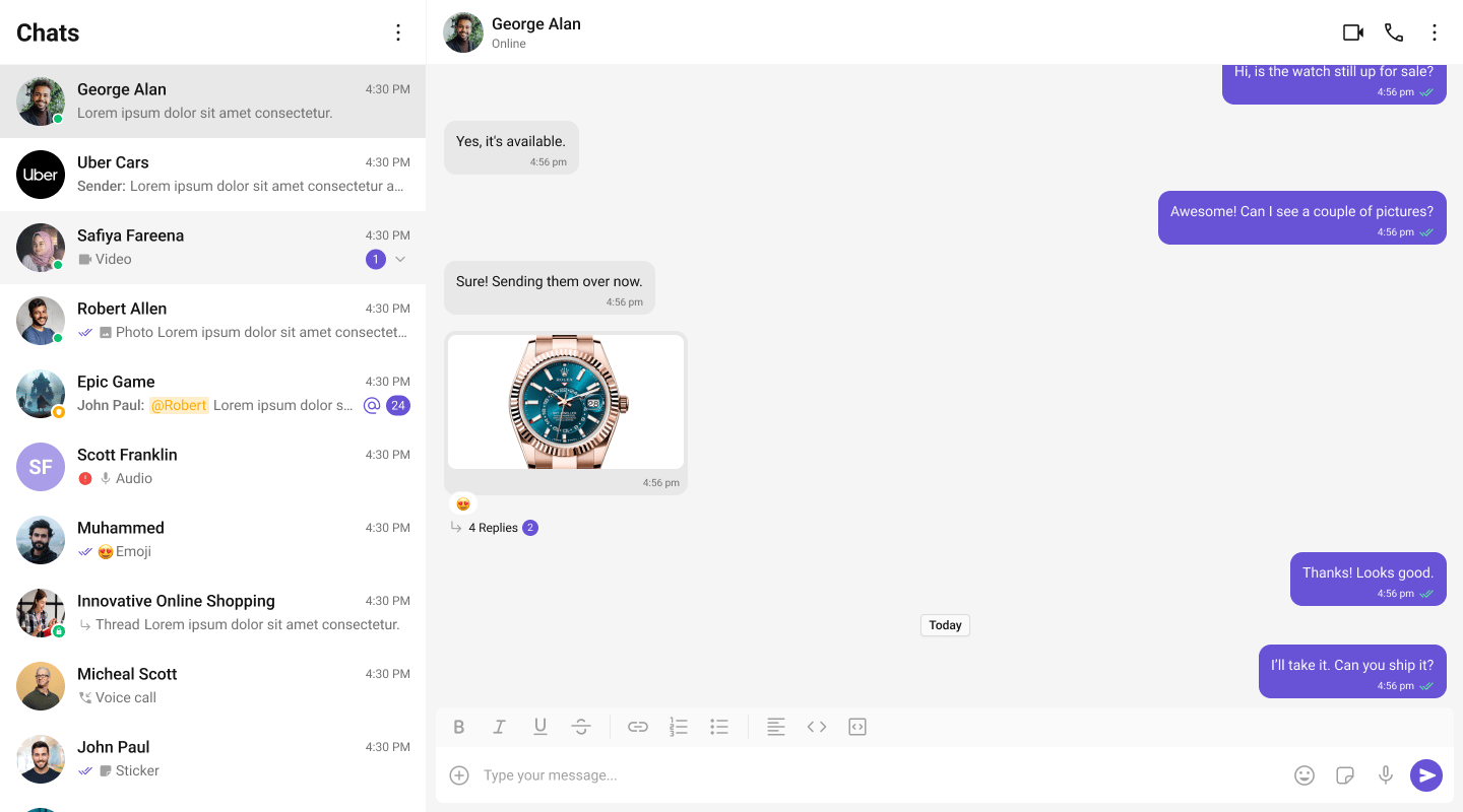
http://localhost:5173 (Vite) or http://localhost:3000 (CRA). You should see the conversation list on the left. Click a conversation to open the message panel.
Layout & Sizing
The UI Kit components areheight: 100% / flex-fill — they fill their parent rather than sizing to their content. If the host layout doesn’t give them room, they collapse to a sliver or overflow. The bare height: 100vh in the example above is the minimum; keep these rules in mind:
- Give the container a content-independent height and width. Use
height: 100dvh(or100vh) on the outer wrapper — notmin-heightorauto, which collapse to ~0px because the components have no intrinsic height. - Constrain flex children so they scroll instead of growing. Add
min-height: 0(andoverflow: hidden) to flex columns that hold a message list; without it, a long list pushes the whole layout taller instead of scrolling internally. - Reset any app scaffold that caps
#root. A fresh Vite/CRA#rootis oftenmax-width-capped, centered, and padded (from the starter’sindex.css/App.css) — which renders the chat gutter-boxed. Clear those:src/index.css - Don’t put
transformorfilteron an ancestor. Either property creates a new containing block that clips the kit’sposition: fixedoverlays — context menus, the emoji keyboard, and the call screen.
Responsive layout
The two-panel example is a fixed side-by-side layout, which squashes on a phone. On narrow viewports, show one pane at a time — the conversation list, then the message view with a back button. Drive it off a breakpoint:isMobile and whether a conversation is selected, and use CometChatMessageHeader’s built-in back button (it renders by default; wire onBack to clear the selection, or set hideBackButton to control it) to return to the list:
Choose a Chat Experience
Conversation List + Message View
Two-panel layout — conversation list on the left, messages on the right.One-to-One / Group Chat
Single chat window — no sidebar. Good for support chat or embedded widgets.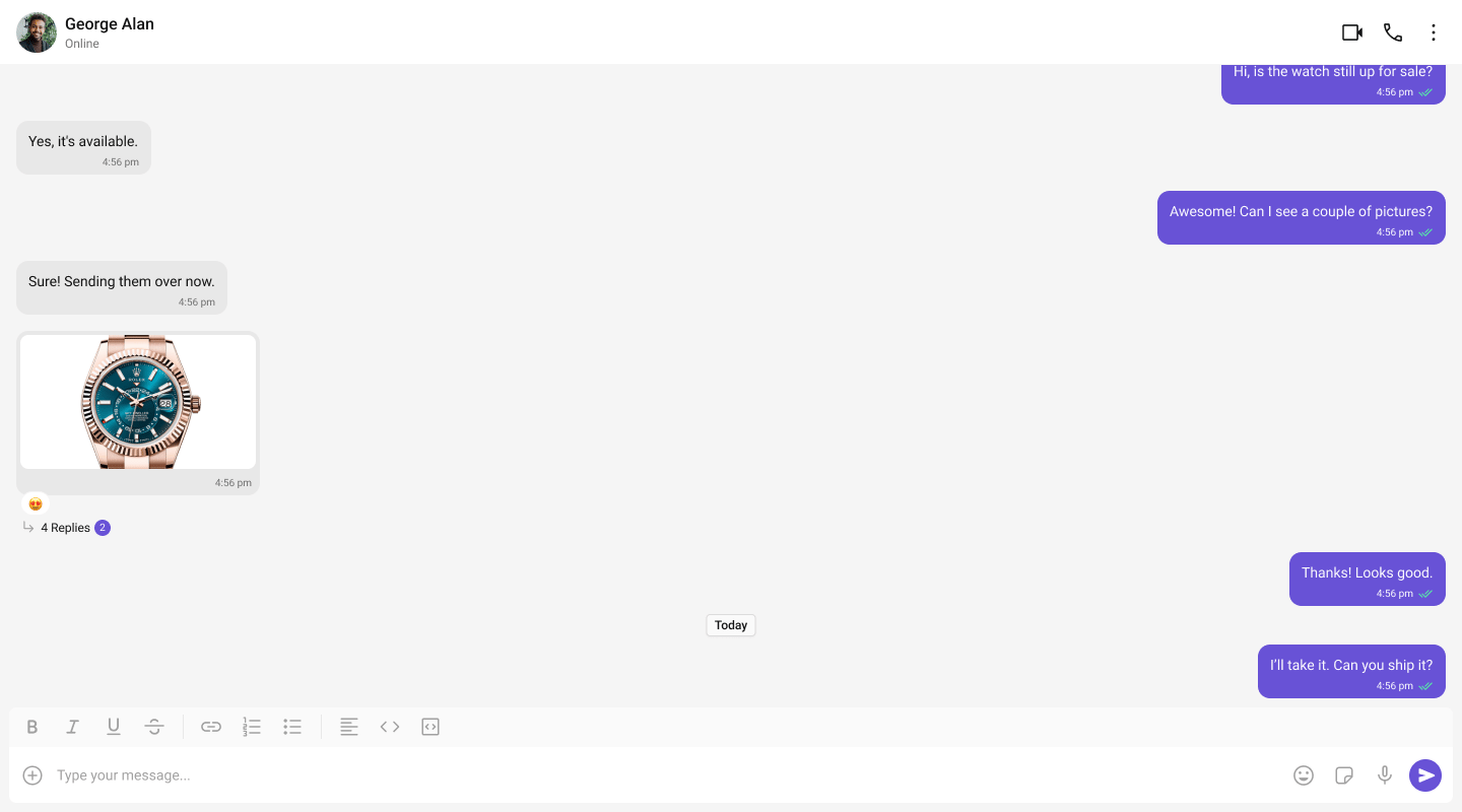
Tab-Based Chat
Tabbed navigation — Chat, Call Logs, Users, Settings in separate tabs.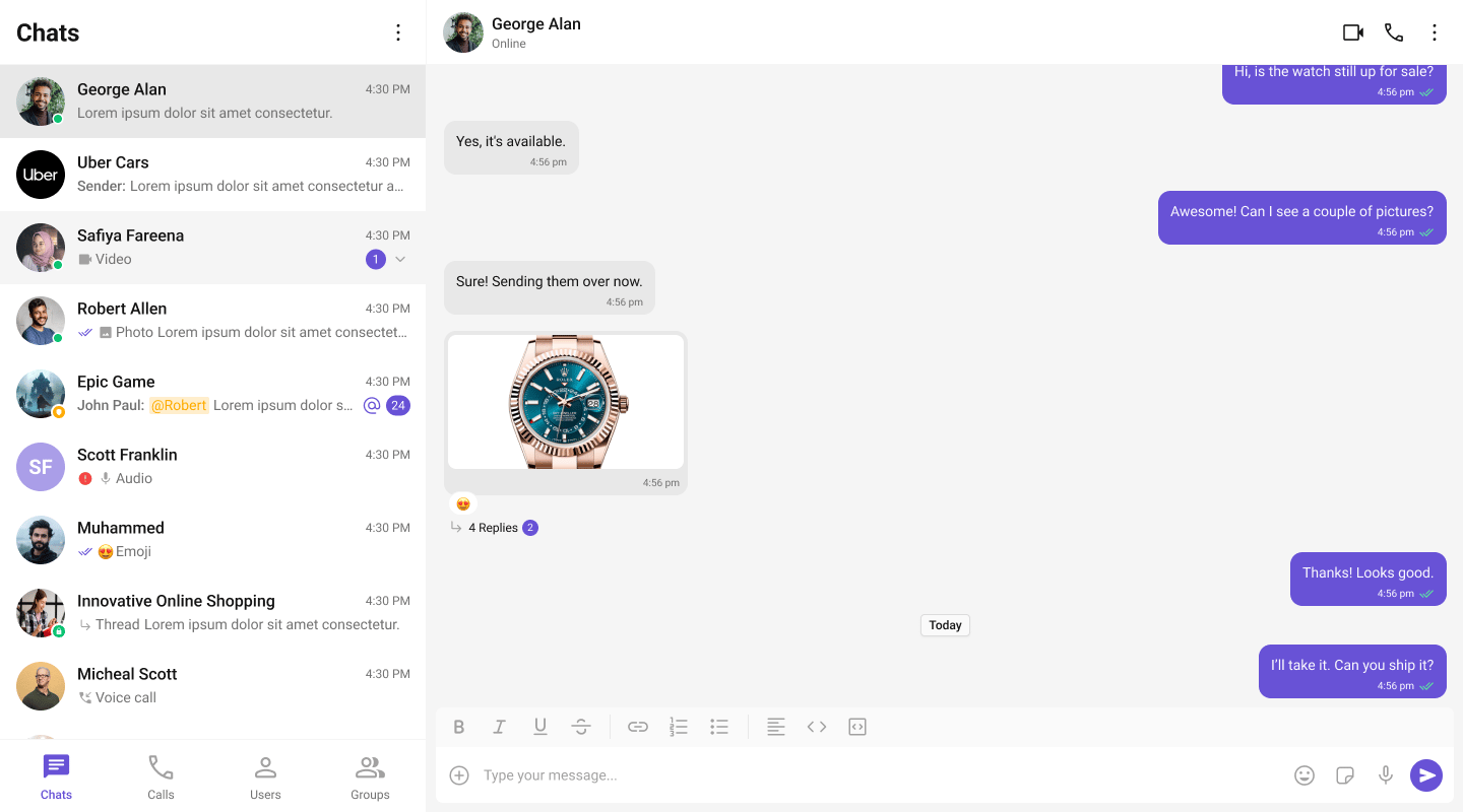
Build Your Own Chat Experience
Need full control over the UI? Use individual components, customize themes, and wire up your own layouts.- Sample App — Working reference app to compare against
- Components — All prebuilt UI elements with props and customization options
- Core Features — Messaging, real-time updates, and other capabilities
- Theming — Colors, fonts, dark mode, and custom styling
- Build Your Own UI — Skip the UI Kit entirely and build on the raw SDK
iFrame Embedding
If your React app runs inside an<iframe>, wrap your tree in CometChatFrameProvider so dialogs and portals mount in the correct frame:
Next Steps
Components Overview
Browse all prebuilt UI components
Theming
Customize colors, fonts, and styles
Plugins
Customize message rendering
Troubleshooting
Common issues and fixes